Most printing problems are not printing problems — they are file problems. A logo that looks sharp on a screen can fall apart on a fabric label, and a colour that matches on your monitor can shift badly on a coloured mug. This guide covers what to send so your order comes out right the first time.
Preferred file formats
- AI / EPS / PDF / SVG (vector) — best option for almost everything. Vector artwork scales to any size without losing quality and lets us separate colours for screen printing or foil stamping.
- PDF with editable text — second best. Make sure fonts are outlined or embedded.
- PSD / TIFF / PNG at 300 dpi — acceptable for full-colour (CMYK) printing such as flyers, boxes and sublimation. Not ideal for screen printing or engraving.
Please avoid Word documents, PowerPoint slides, screenshots and JPEGs pulled from social media. We can usually redraw them, but that adds time and a redraw fee.
Resolution and size
Resolution is measured at the final print size, not at the size your file happens to open at. A 500 × 500 px logo that prints at 10 cm wide on a tote bag is fine (125 dpi is borderline, 300 dpi is comfortable). The same file stretched across the back of a jacket is not.
Rule of thumb: for raster files, supply 300 dpi at the largest size you will ever print.
Colour: CMYK vs Pantone
- CMYK process printing (flyers, boxes, full-colour transfers) reproduces photos and gradients but cannot hit an exact brand colour reliably.
- Pantone spot colour (screen printing, pad printing, some packaging) gives a far closer match to a specified brand colour.
Send your Pantone reference (for example Pantone 286 C) whenever brand accuracy matters. Screens are RGB and backlit; prints are pigment on a material and viewed in reflected light. A small shift is normal and is covered in our risk disclaimer.
Bleed, margins and safe zones
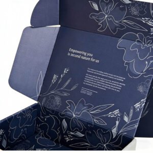
- Bleed: for anything printed edge-to-edge (flyers, boxes, banners), extend background colour 3 mm beyond the trim line.
- Safe zone: keep text and logos at least 3–5 mm inside the trim line so nothing is cut off.
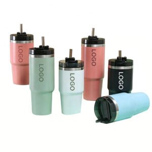
- Print area: on physical products, the printable window is limited by seams, handles, zips and curvature. We will show the exact window on your proof.
Fonts and thin details
Convert text to outlines (curves) before sending, or embed the fonts. Very thin strokes below about 0.5 mm tend to fill in on screen print and disappear on embroidery — thicken them or drop them. Tiny text under 4 pt is not reproducible on most surfaces.
What happens next
We pre-flight every file before it goes to press and will tell you if something will not reproduce, with a suggested fix. You approve a digital proof before production starts. For full artwork terms, see our Terms & Conditions; for common questions, see the FAQ.